Full Disclosure         PMC 30         Client Contract        Core Beliefs        Brochure (Form ADV Part II)


Thursday, April 1, 2010

Low Risk High Reward Investments

Mohnish Pabrai, hedge fund manager of Pabrai Investment Funds, is quoted as saying, "Investing is painfully easy for me." While Asif and I don't always feel that way, sometimes opportunities do seem so obvious that we question the market's sanity. As an example, Oil hitting around $35 per barrel in February 2009 last year was one of those moments. It's currently trading at about $85 per barrel.

When these high probability opportunities arise, it's best not to let them go to waste. We at PMC recently stumbled upon one of those opportunities. This is the story of a stock we purchased for some of our clients last Friday. Why only some? Because, we felt some of our clients already had enough exposure to the sector that the investment opportunity was in, and there is still a big difference between a high probability investment and a sure bet. With the market there is no such thing as a sure bet.

The company I will be discussing is Noble Corp symbol NE. Noble Corporation provides offshore contract drilling services for the oil and gas industry worldwide. -Source Yahoo Finance. Noble is a part of the PMC30 and thus we are always keeping a close eye on it among many others. During the trading day I am often thinking in the micro scale of time while after it closes it is easier to consider the macro. Every day after the market closes, I make sure to look and reflect on what's been happening. In the evenings, Asif and I discuss the market that day and what we think is likely to occur in the future. It was last Thursday when I brought up Noble. After talking it over, we decided that we'd consider buying it in the morning.

Here I will attempt to give the overall analysis we used in deciding to purchase the stock. There are a multitude of reasons that all converged towards the decision.

Firstly, we liked the industry. The world needs oil. It would be great if the world had plentiful cheap viable alternatives, but frankly it doesn't. And even if it did, it would take a great deal of time to get the world off oil. Humanity is currently trending towards more consumption not less. Meanwhile, it is a fact that oil supplies are diminishing. Also, Noble deals with offshore drilling and President Obama had already indicated that he was open to more offshore drilling in his State of the Union Address.

Beyond that we looked at the fundamentals of the stock. We consider ourselves value investors. That means we want to buy stocks when we consider them on sale. Noble is inexpensive. Why? Well to keep it short, Noble trades at a less than an 8 forward p/e ratio. It has less than a .6 PEG ratio, and it's price to book ratio is below 1.6. We've explained those ratios in previous articles if you are wondering what they mean. It does have debt, but it also has a lot of cash. Its debt isn't really big enough to consider it a deal breaker. Noble also pays a small dividend which is always a nice thing.

After looking at the fundamentals, we consider the technicals of a stock. Noble had closed on a support level and was only slightly above the convergence of multiple supports. The stock had been fluctuating between a channel range since October 8th, 2009. The stock was nearing two major moving averages. Both the 200-day and 500-day moving averages were less than a dollar below where the stock currently sat. The stock hadn't been below the 200-day moving average since July 8th, 2009. In addition, the lowest the price had closed since October 8th was right about the same level where the 200-day and 500-day now sat. When multiple types of support converge you can assume that strengthens the support. It would take something major for the stock price to break through something like that. I've previously explained moving averages in another article if you need to brush up. Thirdly, the stock was riding along the bottom Bollinger Band. A Bollinger Band is based on the 20-day moving average. What it does is it puts one band 2 standard deviations below the 20-day moving average and one band 2 standard deviations above it. In theory, the stock movements should remain within the bands ~95% of the time. Traders often use these upper and lower bands to look for an entry or exit point in a stock. The Bollinger bands can act like support and resistance. That is, traders buy the stock when it is on the bottom band and sell it once it reaches the top band.


Click on the pictures to enlarge.

Other technical indicators also looked good. The RSI, or Relative Strength Index was nearing oversold. RSI is a momentum indicator that compares the size of recent gains to recent losses in an attempt to determine whether a stock is overbought or oversold. The Stochastics also indicated that the stock was oversold. The Stochastic Oscillator is a momentum indicator that compares a stocks closing price to its price range over a 14-day period. Neither of these indicators is perfect, but when both are showing the same thing, it raises the accuracy of their readings.


Lastly, the volume of trading in the stock had been decreasing over the last 3 days. Since the stock had fallen over those days but the volume kept going down, it indicated to us that the selling pressure was lessening.


On Friday morning, March 26th, we watched the stock closely. We ended up purchasing the stock near its daily low and it closed up with a gain for the day. Based on our analysis on Thursday, we thought that there was likely around a downside of 2% and an upside of around 13% based on Thursday's closing price. When we purchased the stock on Friday it ended up being even better odds. That is what you would call a compelling risk reward scenario.

What would we have done if the stock would have broken below where we thought it could bottom out? A lot of traders would see that as an indication to sell the stock. These traders generally do not care about the fundamentals of a stock and are trading solely on technical analysis. Since we primarily view stocks through their fundamental value, we would generally have seen it as a buying opportunity. If we were willing to buy the stock at a higher price, why would that change if it got even cheaper? The stock is currently up ~7% from where we bought it. Not bad for a week's return. Meanwhile, the S&P 500 returned slightly less than 1% during the same period of time.

This was one of those rare opportunities where everything seemed to line up for us. It's not every day that something like this occurs. I write about it in the hopes that if you see an opportunity like this, you will know to take advantage of it. Warren Buffet said, "There are no called strikes in the ballgame of investing. You do not lose a single penny by passing on any given investment. Even if someone else hits a home run with it, doesn’t mean that you are missing out. That said, you will have to swing the bat if you ever want to get anywhere. Just make sure it is a good pitch." Here we had a good pitch and we made sure to swing. Given that you only have a certain amount of money to invest, why waste it investing on bad pitches? Wait for the opportunities to come to you. Obviously, this requires the diligence to take the time to seek them out. If you don't think you are capable or don't have the time or inclination to hunt out good pitches then consider finding someone whom you trust will do it for you.

Update: We exited our clients' positions in Noble on 4/26/2010 at $43.62 and $43.63.


If you would like more information about our advisory services please contact us at panopticmc@gmail.com.

Monday, March 8, 2010

PMC 30 Spotlight - Apple Inc.

This is the second post in our series of the PMC 30 Spotlight, where we provide an in depth look at an individual stock and explain how it fits into our investment thesis. The PMC 30 can be seen on the right of the blog. Inclusion in the PMC 30 does not mean that we would buy the stocks at their current valuations.

Apple Inc., together with subsidiaries, designs, manufactures, and markets personal computers, mobile communication devices, and portable digital music and video players, as well as sells various related software, services, peripherals, and networking solutions. The company sells its products worldwide through its online stores, retail stores, direct sales force, third-party wholesalers, resellers, and value-added resellers. In addition, it sells various third-party Macintosh, iPhone, and iPod compatible products, including application software, printers, storage devices, speakers, headphones, and various other accessories and peripherals through its online and retail stores, and digital content and applications through the iTunes Store. The company sells its products to consumer, small and mid-sized business, education, enterprise, government, and creative customers. As of September 26, 2009, it had 273 retail stores, including 217 stores in the United States and 56 stores internationally. The company, formerly known as Apple Computer, Inc., was founded in 1976 and is headquartered in Cupertino, California.

During the quarter Apple elected retrospective adoption of the Financial Accounting Standards Board’s amended accounting standards* related to certain revenue recognition. Adoption of the new accounting standards significantly changes how the Company accounts for certain items, particularly sales of iPhone® and Apple TV®. “If you annualize our quarterly revenue, it’s surprising that Apple is now a $50+ billion company,” said Steve Jobs, Apple’s CEO. “The new products we are planning to release this year are very strong, starting this week with a major new product that we’re really excited about.” “We are very pleased to have generated $5.8 billion in cash during the quarter,” said Peter Oppenheimer, Apple’s CFO.

We at Panoptic Management Consultants, Inc. are huge believers in the technology sector. The fundamentals of tech companies are some of the strongest across all of the S&P 500 sectors. In the case of Apple, Inc., they have almost $40 billion in cash and short-term equivalents, and no long term debt. With this amount of cash, they could literally buy Morgan Stanley! Instead, Apple decides to focus all their efforts on innovation and incremental updates of their already existing products.

They have their hands in many of the fastest growing sub-sectors of technology. iPhone has revolutionized the smartphone market, iPod continues to dominate mp3 players, and the Mac computer line continues its comeback story. Macintosh computers have not broken 8% of the US PC market share in over a decade. This in my opinion is the real growth story going on at Apple. Macs are no longer shunned by enterprise users, and the ability to use Windows via BootCamp or Parellels allows PC users to easily transition to the Mac ecosystem. Apple has a virtuous "halo effect" going for them as well. A customer will buy an iPhone, an iMac a year later, etc. Their newest creation, the iPad, launches April 3, 2010. Its aggressive pricing will make it Apple's entrant into the ultramobile computing space.

I was lucky enough to attend the Apple, Inc. Shareholders Meeting on February, 25, 2010. There were a few interesting moments during the shareholder proposed votes on sustainability. At the first opportunity for audience participation just several minutes into the proceeding, a longtime and well-known Apple shareholder--some would say gadfly--who introduced himself as Shelton Ehrlich, stood at the microphone and urged against Al Gore's re-election to the board. Gore "has become a laughingstock. The glaciers have not melted," Ehrlich said, referring to Gore's views on global warming. "If his advice he gives to Apple is as faulty as his views on the environment then he doesn't need to be re-elected." - source CNET What CNET doesn't mention is that the glacier comment drew large amounts of laughter.

After the shareholder votes were cast, there was a question and answer session. CEO Steve Jobs, COO Tim Cook, and CFO Peter Oppenheimer came to the stage. I immediately got in line. I proceeded to hear questions from other shareholders mainly about what to do with the $40 billion in cash on the balance sheet. Dividends, buybacks, and even buying Tesla Motors were suggested. Mr. Jobs had a better idea, TOGA PARTY!

After 6 other shareholders, I got to talk to Mr. Jobs. I told him I had two questions on video gaming:

Why does Apple not have a 1st party developer studio for video games? (Microsoft, Sony and Nintendo all do)

I had an interesting back and forth with Mr. Jobs about this topic. He responded that the thousands of games made by 3rd party developers on the App Store were great, and he didn't see any reason for Apple to compete. I mentioned that "I hear Apple is good at making innovative products, and maybe they could bring something to gaming that other developers hadn't thought of." This even got a laugh from Mr. Jobs.

Would Apple be open to a strategic alliance to bring iTunes content to a video game system?

Netflix has been assaulting Apple on all three video game consoles on the downloadable video front. I broke down the market analysis: Microsoft has the Zune Marketplace, Sony has a load of content. but Nintendo is sitting there not doing much about selling media. I asked if a strategic alliance with Nintendo is something worth doing. He responded that "strategic alliances are tricky, but if they are profitable they are always worth doing."

It was truly a great honor to speak with the 3 top executives at Apple, Inc.

At the time of this post, Apple, Inc. is trading very near its all-time high. It is on the verge of surpassing Walmart for the 4th largest market capitalization in the S&P 500, and has Microsoft in their sights! Not bad for a small company started in a garage in Northern California.

Full Disclosure:

Our CEO, Asif A. Khan, CPA (or his family members) is:

Long Apple, Inc. Common Stock.
Short Apple, Inc. Put Options

Long Nintendo Common Stock
Long Microsoft Common Stock
Long Walmart Common Stock

Long Morgan Stanley Common Stock
Long Morgan Stanley Call Options
Short Morgan Stanley Put Options

Sunday, March 7, 2010

A Supplemental Note on MACD

This note is a supplement to the one below it. I felt it may be useful to show how MACD can be an effective tool on more than just a daily chart of a stock. MACD can be used on any time scale chart and works with indexes in addition to individual stocks. Below is a monthly chart of the S&P 500. The chart covers the period from late 1996 until the present. During that period, the S&P has crashed twice. One was the .com bubble burst that lasted from 2000 until 2003 and the other was the mortgage crisis crash that took place mostly during 2008.


Remember, usually the MACD histogram bar chart and the stock price chart move in the same direction. That is, if the stock price is going up the MACD histogram is going up and vice-versa. If they are moving in opposite directions, this is a signal that the a directional change may occur in the stock so that it will again be moving in the same direction as the MACD histogram. In those situations, the MACD histogram is a leading indicator. It gives you an idea of what the price of the stock or the index may do in the future.

Sadly, the MACD histogram did not call the bottom of the 2008 market crash. There was no divergence in the MACD histogram and the S&P price to give a signal. The MACD line crossing the signal line did serve as a useful indicator, but it was a lagging indicator. There was already a substantial recovery occurring in the S&P before MACD gave any signal of it. However, MACD divergence did make an accurate and timely prediction of the market top in 2000, the turnaround in 2003, and the market top in 2007. I'm going to discuss the 2003 turnaround and the market top in 2007 because they are the easiest to see.

The first market top occurred in 2000. From that point you can see that the S&P fell from about 1550 to roughly 765 (a downtrend) between the years 2000 and 2003. During that period, the MACD histogram had a pretty deliberate trend moving from the negative to the positive (an uptrend). In early 2003, the MACD line crossed over the gray signal line and the histogram turned positive. From that point, the market continued its trend upward until late 2007. However, the MACD histogram had been trending down towards the negative and finally went negative with the MACD line crossing below the gray signal line in late 2007.

In both situations, people paying close attention to the MACD on the monthly S&P 500 chart would have had a pretty good chance of catching both the bottoms and the tops of the market. Technical investors like to see confirmation of a signal. In the case of the 2007 market top, not only was the MACD signaling that things were going to make a turn for the worse, there was also a "double top". Do you see how the market basically topped out in 2007 at the same point it did in 2000? This is a very common chart pattern that technicians look for, but I'll save further discussion on that topic for another time.

Thursday, March 4, 2010

A Note about Moving Average Convergence Divergence (MACD)

Moving Average Convergence Divergence (MACD) is one of the most popular technical indicators used by investors. MACD is a trend-following and momentum indicator. In theory, trend following should not work. If the market were totally efficient there would be no trend to follow. However, in practice research has shown that trend following can produce average beating returns. There are of course many caveats. Trend following can result in "whipsaws" or false trends that do the opposite of what an investor anticipates. For this reason, PMC only uses trend following technical analysis for stocks that we already see value in. We use value investing for strategic stock selection and trend following mechanisms like MACD for tactical investment decisions. We believe that by only using technical indicators like MACD on stocks that we think are already mispriced, we lesson our chances of downside and increase our chances of upside.

MACD is composed of two lines. One is a signal line that is a 9-day exponential moving average. An exponential moving average is a moving average where more weight is given to the latest data. The other line is the MACD line which is determined by subtracting the 26-day exponential moving average from the 12-day exponential moving average. When the signal line crosses over the MACD line, this is a bullish indicator. when the MACD line drops below the signal line, it is a bearish indicator.

One of the most effective uses of the MACD is to look for stock price and MACD or MACD histogram divergence. A MACD histogram is simply a bar chart where each bar shows the difference between the MACD line and the signal line.


The above picture is an example using a recent daily stock chart from Nvidia Corporation. Please click on the chart to see a large version. In this chart there are two divergences between the stock price and the MACD histogram. The first is where the stock is trending down during the months of October and November while the histogram is trending up (the histogram is moving up towards 0 from higher negatives). Notice when the MACD blue line crosses the silver signal line, there is a jump in the stock price. Careful watchers of the MACD histogram divergence could have predicted this upward move. The second divergence is during the month of December and January. The stock price makes an unrelenting upward move while the MACD histogram is trending down towards 0. Once the MACD line crosses under the signal line, there is a long downtrend. I have also marked the support level of the stock given that support was discussed in a previous note.

As you can see, MACD can be an effective tool in predicting trends and momentum in a stock. Combining divergence in the histogram with the signal line improves the probabilities of the MACD's accuracy. PMC does not recommend that you solely rely on MACD to make investment decisions. We feel it is not accurate enough for those purposes. It should only be used as a supplemental tool to determine an entry or exit from an equity position.

Wednesday, February 3, 2010

A Note about Price-to-Earnings Ratio

What is more expensive, Google at $553 per share or Amazon at $127 per share? If your answer was Google, you definitely should read this post. The price per share of Google is most definitely higher than Amazon, but there are much better ways to compare their value. The price of a stock and its value are not necessarily the same. Adam did a great job of explaining Price-to-Book Value in a previous post and I will attempt to explain another way to value a company's stock, the Price-to-Earnings Ratio.

Earnings are the mother's milk of stocks and the Price-to-Earnings Ratio is a method of using earnings per share (EPS) to value a stock. Price-to-Earnings Ratio is calculated as follows:

market value of a share / earnings per share

The Price-to-Earnings Ratio (P/E) is sometimes referred to as the "multiple", because it shows how much investors are willing to pay for each dollar of earnings. If a company were currently trading at a multiple (P/E) of 10, the interpretation is that an investor is willing to pay $10 for $1 of current earnings.

In general, a high P/E suggests that investors are expecting higher earnings growth in the future compared to companies with a lower P/E. However, the P/E ratio doesn't tell us the whole story by itself. It's usually more useful to compare the P/E ratios of one company to other companies in the same industry, to the market in general or against the company's own historical P/E. It would not be useful for investors using the P/E ratio as a basis for their investment to compare the P/E of a technology company (high P/E) to a utility company (low P/E) as each industry has much different growth prospects. - source Investopedia

Earnings growth should also be considered when valuing a stock. Another ratio has been devised called the PEG:

P/E Ratio / EPS Growth % = PEG ratio

Always try to have a margin of safety in your investments. Not only does it help on the downside but low P/E stocks have substantially outperformed high P/E stocks. PMC tries to find stocks trading at low P/Es and low PEG ratios. A company growing 5% faster than the rest of the market with a P/E twice that of the market will have to continue growing for another 14 years at that rate before the shareholder is fairly compensated. A problem that arises with PEG ratio analysis is that it is based on projections of expected earnings and expected earnings growth.

Back to Google vs Amazon. Amazon trades at a forward (looking 12 months into the future) P/E of 33.53 while Google trades at a forward P/E of 17.60. Already it is apparent that investors are willing to pay more per dollar of Amazon's earnings than Google. But what is cheaper? When we look at the PEG ratios of both stocks it becomes more apparent. Amazon's PEG ratio is 1.56 while Google's PEG ratio is 0.92. Investors are once again paying up for Amazon shares while Google's P/E trades below its EPS growth rate. I tend to like companies with PEG ratios between 0.50 and 2. Even though neither stock trades above a 2 PEG ratio, Google is far more attractive on a long term basis. A lot of Amazon's growth is priced into the stock.

Fundamental analysis is a huge part of our investment selection process at PMC, and Price-to-Earnings, PEG and Price-to-Book ratios are all very important factors we take into consideration when making decisions.

Full Disclosure:
Our CEO, Asif A. Khan, CPA (or his family members) is long Google common stock.

Sunday, January 24, 2010

A Note about Support and Resistance

Modern economic theory is based on the idea that the market moves in a random walk. That is, the movement of the market and the stocks that comprise it cannot be predicted. In contrast, most experienced stock traders believe that the psychology of the market can be interpreted through its price action. One of our core beliefs is that close attention should be paid to technical trends. If a price movement has a certain sentiment behind it, there is a good chance that the stock will move in a predictable fashion. Technical analysts look for what they call "high probability" trades or outcomes. Who is one to believe: the efficient market economists, or the technical traders? The Federal Reserve Bank of New York weighed in on the matter:

"Technical analysis, the prediction of price movements based on past price movements, has been shown to generate statistically significant profits despite its incompatibility with most economists' notions of "efficient markets." Federal Reserve Bank of New York, C.L. Osler and P.H. Kevin Chang, Staff Report No. 4, August 1995.)

Support and Resistance are among the most basic forms of technical or chart analysis. I felt that this would be a good topic to cover today since support played an important role in the recent market downturn that happened last week. Many stocks that PMC tracks had long term support break down last Thursday or Friday. I'm going to focus on one of those stocks for this article.

This is a daily candlestick chart of Google Inc. from March 2009 until January 22, 2010. Please click on the image to see the entire chart.


This is called a candlestick chart. The red candles represent down days and the green candles represent up days. The bottom white line I have drawn represents where the support of the stock is. Support means that the stock is not likely to break below that area unless there is some change in sentiment. The support exists because there is sufficient buying demand at these levels to overcome selling pressure. The upper line represents where resistance is in the stock. This is where the stock is unlikely to break above unless there is some sort of change in people's opinion of the stock. This is the point where selling pressure overcomes the buyers of the stock. When the support and resistance are both trending upwards in this fashion, it is called an ascending channel. Each time the stock bounces off of the support or resistance traders notice, it reconfirms the support, and makes them all that much more difficult to break out of the next time.

You may ask, why does the stock haves support and resistance? Likely, some of it has to do with self-fulfilling prophecy. Humans are pattern recognition machines. When many people see the same pattern in the stock chart they may react in the same way. There are other reasons such as automated trading programs utilized at large institutions, people's propensity to focus on even numbers, or any other number of reasons. Ultimately, it doesn't really matter why it works just as long as it does.

As you can see in the above chart, Google stayed in its channel for nearly eleven months. There are a few different strategies that could have been successfully employed with Google over this time period. Since the channel was ascending, the most logical strategy would have been to purchase the stock in March or after the support had been confirmed and held onto it until the support level was broken on January 22nd.

So why after 11 months did Google drop below its support level (as shown in the circled portion of the chart)? On January 21, 2010, Google reported their quarterly results and the market reacted poorly to the news. The quarter's results changed the investors sentiments about the stock and thus there were no longer enough buyers at the support level to keep the stock elevated to that level. When a stock breaks below a major support level, often they fall to the next major support level. Major moving averages of a stock are often seen as support levels for stocks. The yellow line on the chart represents the stock's 100-day moving average. Once traders saw that Google had breached its previous support level, there was a high probability of the price falling to a major moving average. The 100-day happened to be the closest to the support level, and so one could have shorted the stock until the price reached the 100-day moving average and then covered their short with a relatively high probability of success. As you can see, Google closed almost exactly on the 100-day moving average.

Before investing in stocks, we recommend looking at both longer term and short term charts to determine where major support and resistance levels exist for a stock. Generally, it is not wise to buy a stock near its resistance level. On the other hand, buying near a major support level can give you some confidence that you bought the stock for a good price. However, nothing is certain. Many people bought Google on January 20th assuming that it would move back up after hitting its resistance level, but unluckily for them, this happened to be the time that the stock broke down below its support because of the change in the sentiment of the stock.

Monday, January 18, 2010

A Note about Bear Markets

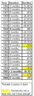
A bear market is a market condition in which the prices of securities are falling, and widespread pessimism causes the negative sentiment to be self-sustaining. As investors anticipate losses in a bear market and selling continues, pessimism only grows. Although figures can vary, for many, a downturn of 20% or more in multiple broad market indexes, such as the Dow Jones Industrial Average (DJIA) or Standard & Poor's 500 Index (S&P 500), over at least a two-month period, is considered an entry into a bear market. - source Investopedia

Here is a List of the largest bear markets of the last century:


Bear markets have always been temporary and thus can be viewed as "stock sales." The price of a stock is not a company's true value but only an approximation based on the supply and demand of the shares. There is no guarantee that these two ideas are always perfectly aligned. This disconnect from the fundamentals of a company can provide some of the best opportunities to invest. During the most recent bear market, stocks were priced for the apocalypse. As we now see the world did not end, and as a result you were rewarded handsomely for buying shares in between October 2008 and March 2009.

After making a closing high of 1561.80 on October 12, 2007 the S&P 500 entered a bear market that came to an abrupt end on March 9,2009 at 666.79. This was a drop of 57%, making it the third most severe bear market in 100 years. Stocks were on sale. Many companies were priced for bankruptcy including some of America's largest banks. Although the market has rallied all the way back to 1,136.03 from the bottom, a 70% gain from the March 2009 low, the S&P 500 is still 27% below it's October 2007 high. If you did not take advantage of absurd pricing of equities during the highest level of pessimism, you missed out on a huge opportunity to make some of your losses back. Just by purchasing an index fund that tracks the S&P 500 in March 2009, you would be up 70%. Some individual stocks have performed even better.

The 2007-2009 bear market was exacerbated by some modern day issues. The SEC eliminated the uptick rule on July 6, 2007. The uptick rule was implemented in 1938 and prevented short sellers from adding to the downward momentum when the price of an asset was already experiencing sharp declines. The rule required that every short sale transaction be entered at a price that is higher than the price of the previous trade. In March of 2009, following a conversation with SEC Chair Mary Schapiro, Rep. Barney Frank of the House Financial Services Committee said that the rule could be restored. To this day, the uptick rule has not been reinstated. On top of that, computerized trading had become a large part of the volume in the markets. The deadly combination of naked short selling and computerized trading lead to bear raids on stocks like Lehman Brothers, Bear Stearns, and many other companies. The SEC had also approved levered short selling ETFs that allowed investors to buy an instrument to short a sector or market, without the normal short selling margin requirements. The SKF, ProShares UltraShort Financials, was used by hedge funds as well as individuals to pile on the short selling of bankshares. In a world where the government had taken preferred equity stakes in banks, it was mind boggling that they would allow such instruments to exist. Alas, we were in the midst of a negative feedback loop that completely ignored the fundamentals of companies. Short selling fed off of the severely bearish technicals of the market and lead many stocks to their breaking points.

At the peak of the SKF at 268, market sentiment was at the lowest I had seen in my life. The fear was palpable, no one wanted to take risk. These are the moments in the stock market where it pays to be a contrarian, or in this case an optimist. I had one thesis that I held onto: there would be a financial system in the future. If I were to buy a basket of bankshares, the gains would outweigh their losses. I was luckier than I could have ever imagined as the banks left standing in March 2009 did survive and proceeded to give investors some of the best gains in the 2009 recovery. One of our main core beliefs is that it pays to have guts. Put differently by Warren Buffett, "Be Greedy when others are fearful. Be fearful when others are greedy." Although bear markets like the one of 2007-2009 are downright terrifying, times like these have historically been the greatest moments to invest.